This anniversary edition of the Montreal International Fireworks Competition continues to dazzle and is being one of the best since several years. Following Caballer's performance, the Canadian team made by Royal Pyrotechnie and Fireworks Spectaculars Canada did another
excellent show. To paraphrase the thread of our in-house meteorologist, I am not sure whether the weather cooperated (or not) but, thanks to wind direction, the Canadian extravaganza was a very immersive experience for the audience in the grandstands, to say the least! Fortunately, the velocity was high enough to clear the space and to allow a good visibility.
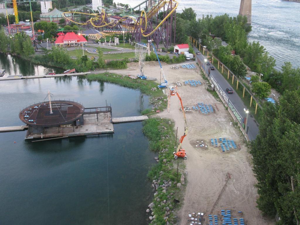
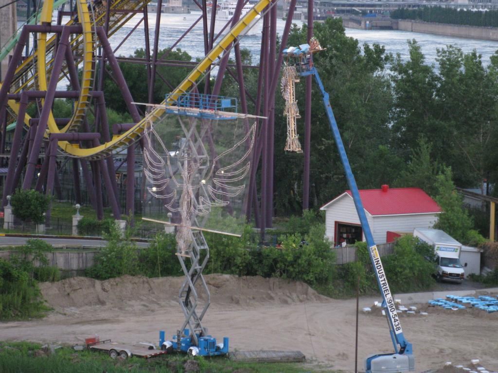
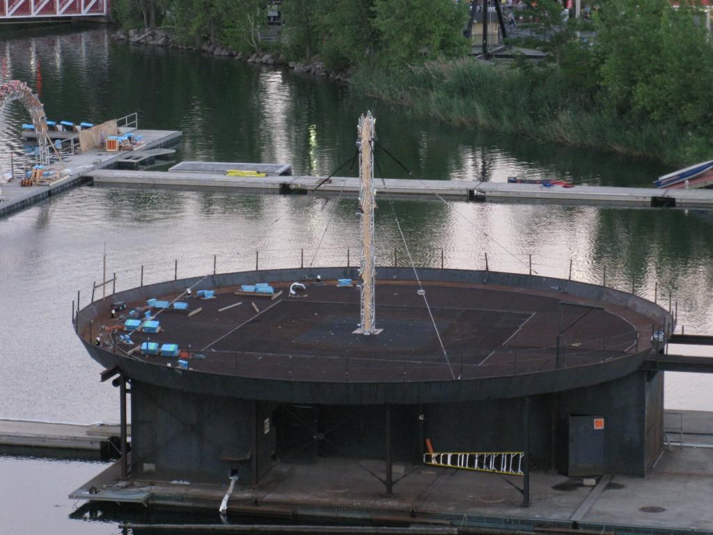
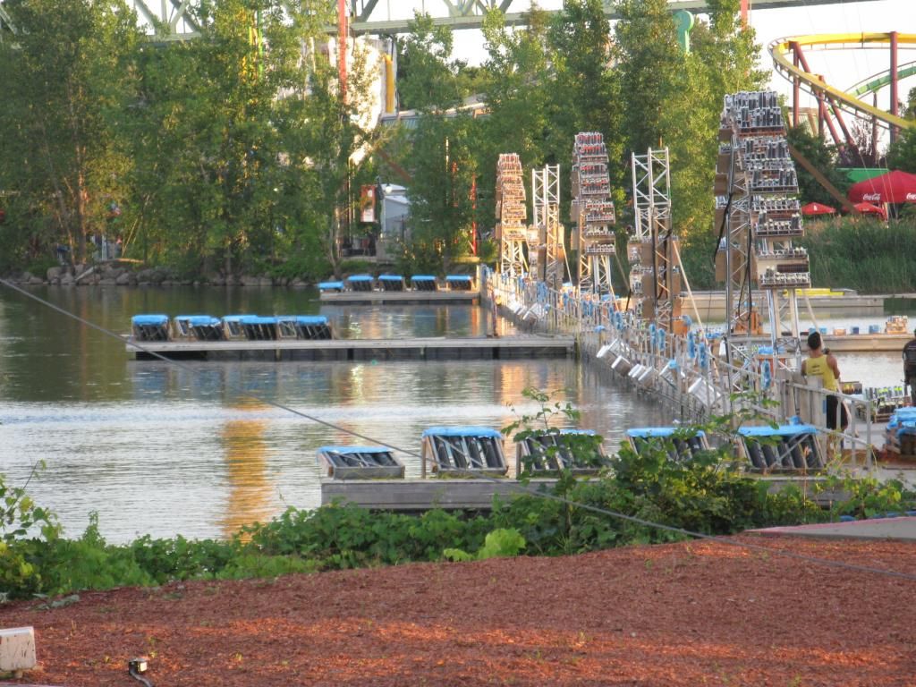
For this first show displayed on Wednesday this summer, I left the office and then arrived at La Ronde, still concerned by professional issues instead of being excited by the upcoming delight. Thankfully, these concerns vanished once I sat in the Ferris Wheel and my anticipation grew as the ride gave me an overview on the firing ramps. The setup was even more complex than what we saw from pictures posted by Paul early. A phoenix-shape set-up piece was located at the far left of the second ramp, two lifted platforms were also located on the same ramp, and a tower was installed in the middle of the fourth ramp. More stuff was located closer to the audience, on the fifth ramp. I was also excited by all the mortars oriented toward the lake. Consequently, the extravaganza was absolutely massive.
I would not be surprised to learn that Canadian designers have done exactly what all contestants in all competitions should do, that is, to start by taking a careful look at the criteria and to keep them in mind through the creative process.
Let's begin with the quality of pyrotechnic pieces. For sure, we enjoyed an extremely broad range of pyrotechnic effects. The 30-minute display basically ran without any repetition. I am not going to list all the effects made - they are countless - but many of them were also very complex. For instance, on the music of Avatar, stars' luminosity of angled mines decreased and then silently burst in another colour and a slightly different shape (21:50-->22:20). Of course, as many other people (including above posters), I was very impressed by the "laser comets" (thanks to Paul and Mylène who taught me the right name), of which luminosity suddenly stopped, note-synchronized with the music. I am pretty sure that we had never seen a such effect in this competition. In the same way that chiefs in 5-star restaurants work hard to find the right products, I suspect that Y. Roy and B. Dezotell did a lot of efforts to find all these pyrotechnic ingredients. While the velocity was strong enough, the smoke may have impacted the vividness of the colours from our point of view. However, I believe that Caballer was slightly better on this specific sub-criterion. Nonetheless, the richness of colours was very good (e.g., the successive barrages of falling leaves, in clusters of various colours, as the phoenix came into life).
Synchronization is another very good aspect of this show. As Duncan wrote, the design wasn't "razor-shape", as some people do like. However, several sequences were note-synchronized and other parts of the show were synchronized in a "looser" way (or with a human-touch, as some people say). This approach fits especially with the artistic choice of previous shows made by Royal Pyrotechnie. (On a side note, the show was very unified despite the co-design process.)
The soundtrack was also a great achievement. We may like or dislike the musics, of course, but the soundtrack has been designed in a such way that all segments perfectly fitted together. The result was close to a 30-minute uninterrupted performance. Some narratives emphasized the storyline, without any disruption. Firstly, the show actually began at the end of the countdown with a massive introduction, The initial narrative was heard only after that opening segment. Secondly, it was always augmented by corresponding pyrotechnic effects, like the red theme as the narrator explained relations between the devil and the fire.
The pyromusical design was also excellent. That is not a surprise from these designers. In the same way that choice of colours or pyrotechnic effects supported the narratives, the fireworks followed the musics throughout the display.
Many things could be written regarding the technical design. The setup outlined above indicates how much efforts were done to make the most of the available space. The show was especially broad, from the lake surface to the highest levels. There were some innovations or rare effects. In addition to the aforementioned laser comets, cakes were installed on each lifted platforms in a such way that they appeared as unusual spherical cakes (at 16:50). Comets and stars erupted from devices launched on the lake. And rare fireball appeared in the sky. There was almost no empty spot during the whole display. And the finale was absolutely amazing : the combination of large nautical shells and wind direction created an apocalyptic moment.
However, I wonder to what extent the show was too intense during the entire display. A suspect that more serene segments would have helped for more subtle or emotional feelings. It is also likely that another contestant may engage more the audience with a soundtrack better known and less atmospheric. (On this point, I think the designers have decided to remain within the same type of musics than the award-winning soundtrack from the 2009 show.) From a personal point of view, I didn't feel so much engaged by this show, but it may be explained by factors exogenous to the display. I felt more emotional during the Caballer's display, but the Spanish display suffered from minor weaknesses. The Canadian team deserves excellent grades on all the criteria and is a serious contender for a Jupiter.
Fred
 Page 1 of 2: 2 Next »